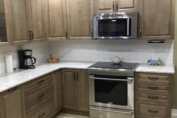
What do you do when you have a 35 year old kitchen with limited space and a non-functional design?
That’s exactly what Ottawa homeowner John asked himself.
His answer? Call on Laurysen.
“Our kitchen was getting old – at least 35 years old. We needed an upgrade,” John explains. “My neighbour had a kitchen done by Laurysen, and I liked it.”
So John and his wife met with our designer Wael Bakr to talk about bringing their kitchen into the modern age.
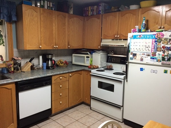
Here’s what it looked like before:
And here’s what it looks like now:
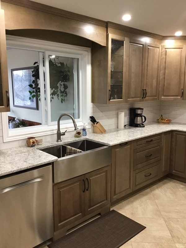
Talk about a transformation!
Their Kitchen Was Cramped, Dark, and Impossible to Use
Before diving into the design, Wael always asks his clients what they like about their kitchen, and what they don’t like. “We’re problem solvers,” Wael says.
“Our kitchen is in the centre of the house, so you don’t get much light,” John explains. “It’s smaller, but I wanted it to be functional.”
Unfortunately it wasn’t possible to expand the kitchen.
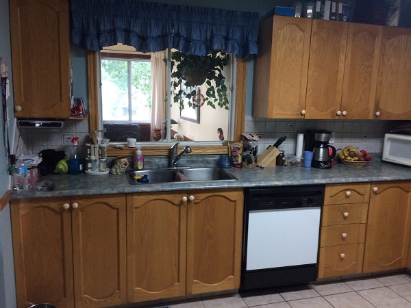
The kitchen was dark and cramped – not what you want in a space that you spend a lot of time in.
Upon visiting their home, Wael instantly saw what the layout problems were. “The appliances were in the wrong places. The fridge was right next to the stove, restricting prep space. The dishwasher was on the wrong side of the sink, disrupting the workflow of the kitchen. They also had a storage problem,” Wael says.
These are all technical things Wael’s trained eye spotted instantly. There was also a large table occupying much of the space, and a small entrance restricting both light and movement.
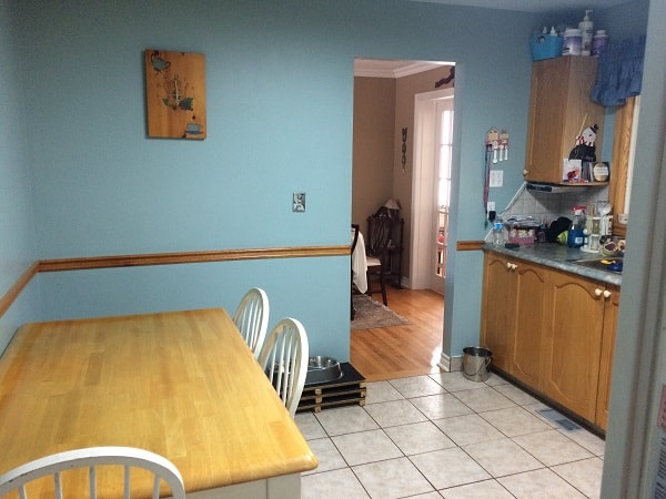
This big wood table takes up almost half the kitchen – that’s a lot of wall space ready to be transformed.
What Didn’t Change
There were a few things that didn’t change when Wael began this project.
- The square footage – due to space restrictions, there wasn’t any way to make the kitchen bigger.
- The sink – sinks work best under windows, where there’s something to look at while you do dishes. Wael recommended that it stay where it was.
- The stove’s general location – while he did move the stove approximately 18 inches to the right, it made the most sense on that wall.
With those design elements in place, Wael set to work to create the perfect new kitchen.
Wael’s Solutions
Here’s how Wael turned a small, cramped space into a kitchen you show off to your neighbours.
1. The Sink and Workspace
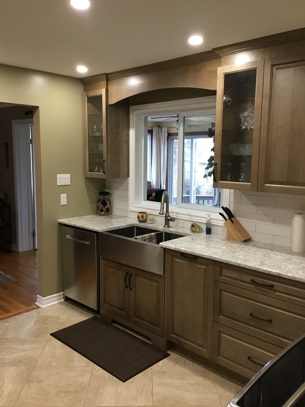
The lighter window trim, tile and countertop made a huge difference.
Wael made a lot of changes to this particular section of the kitchen.
“I moved the dishwasher to the left of the sink. Now they can load and unload it without having to walk around to reach cupboards and drawers,” he explains.
On the right of the sink, Wael included pull-out garbage and recycling for extra convenience. “That’s been a huge help,” John says.
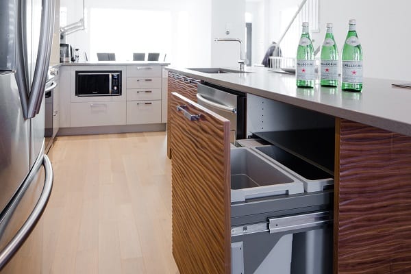
Example of a pull-out garbage and recycling from another Laurysen kitchen.
The window was a unique feature that Wael wanted to keep for the extra light and depth – but he didn’t want it to take away from the design. “I used white trim so the emphasis would continue to be on the kitchen, not the window,” Wael says.
To create a cohesive flow from wall to wall, Wael picked vertical cabinets that went all the way to the ceiling, and included a decorative bridge between the solitary cabinet on the left, over the sink to the cabinets on the right.
Finally, to add a little more depth, Wael suggested a couple glass-fronted cabinets. “You always have something to display in a kitchen,” he explains.
2. More Drawers, More Counters, More Function
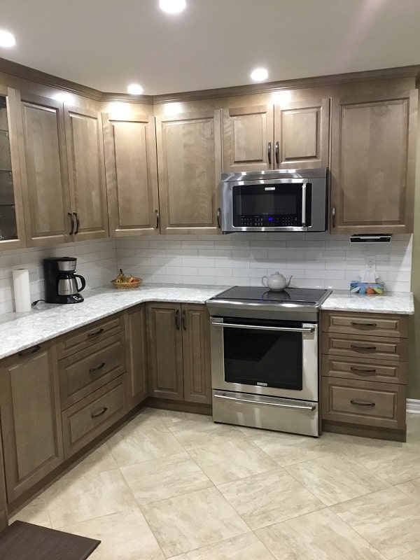
Cooking just became easy and fun again with tons of counter space and a more efficient work flow.
The vertical cabinets continue around the corner all the way to the stove. The additional pot lights further bring out the natural wood grain that was on their wishlist.
“They liked wood, and wanted the natural wood grain in their kitchen,” Wael explains. “But we wanted it to be light and fresh, especially since it’s a small room. So we went with a lighter colour, and played with the tiles. We also opted for a Cambria quartz countertop – a durable and long lasting option.”
“I love the colour of the cabinets, and the wood grain,” John says.
With the additional cabinets – and no fridge crowding the stove – John and his wife have plenty of room to work, and a microwave above the stove that is convenient to use.
Wael also added more drawers to their base cabinets. “They went from 4 basic drawers to 13 in the whole kitchen,” he says. “Now they have bigger drawers close to the stove and in the pantry – perfect for pots, pans and tupperware.”
They also have a super susan in the corner cabinet that takes advantage of a difficult space, and a spice rack on the left of the stove that makes cooking a pleasure.
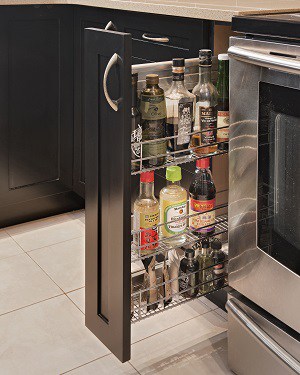
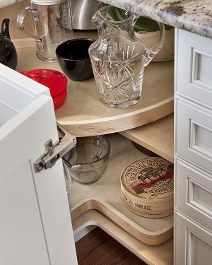 Example of a spice rack and super susan from other Laurysen kitchens.
3. A New Home for the Refrigerator – and New Pantries to Match
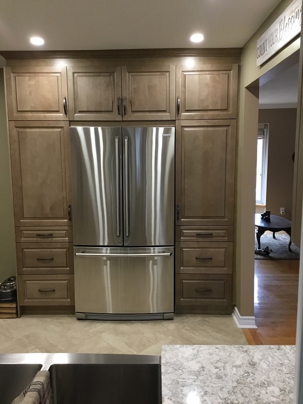
We told you that wall was just waiting to be used!
What was formerly the home of the big wooden table is now home to a beautiful 2-door fridge and gorgeous floor-to-ceiling pantries, which increases their usable space.
The big wooden table was completely removed from the kitchen. “They have a dining room, and if more than 3 people were dining, they couldn’t use the table in the kitchen,” Wael explains. “Now they have a pantry with 6 drawers.”
“The pantry has been a huge help,” John shares. “It makes cooking so much easier.”
Next to the fridge is the entrance into the kitchen.
Before it was narrow and a little cramped. Now?
“We actually widened the door to about 70 inches,” Wael explains. “Physically the room is the same size, but visually and mentally it’s bigger.”
John could hardly believe it when he saw the new, wider entry way. “It’s so great. Opening it up made a huge difference,” he says.
What’s the Verdict?
They’ve only had their new kitchen for a few months, and they’ve already made sure to show it off a lot.
“We brag about it all the time,” John admits. “All the issues we had have been solved,” he continues.
John is thrilled with his new kitchen, and with the Laurysen experience. “We didn’t have a clear idea of what we wanted when we started this project. We met with Wael, and he helped us create a design we loved,” he says. “We love it! I would recommend Wael and Laurysen to anyone looking to redo their kitchen.”
Hearing how happy they are with their new kitchen is when Wael feels happiest about the project. “I’m as happy as they are. It’s where you get the sense of achievement, no matter how big or small the kitchen,” he says.
Have Your Own Laurysen Kitchens Experience
The designers at Laurysen Kitchens can take your kitchen from a before to an after.
All you have to do is book your free consultation, and we’ll meet with you to discuss what you like, what you don’t like, and – most importantly – what you want.
